Teaure — E-Commerce UX, Brand and Motion Design Case Study
Teaure is a conceptual wellness brand exploring what happens when the digital tea-shopping experience is designed around ritual rather than transaction.
The challenge was to create something immersive and atmospheric without making the shopping experience slower, harder to understand, or harder to navigate.
Can digital commerce feel as calming and intentional as the ritual of preparing tea?
Most wellness websites focus primarily on transactions. This project explores how storytelling, motion, and atmosphere can transform online shopping into a more immersive and emotionally engaging experience.
Rather than optimizing purely for conversion, the concept investigates how intentional design can create stronger connections between product, brand, and user.
Designing for Presence.
Teaure is a conceptual project combining brand creation with product exploration. The project began with a simple observation: Most wellness products promise calm, mindfulness, and balance, yet their digital experiences often feel rushed and transactional. This exploration investigates what happens when the digital experience becomes an extension of the product itself.
The Design Hypothesis.
Sensory Disconnect
Wellness is often communicated through calm, tactile and sensory cues. Digital commerce can flatten those cues into product cards and specifications.
Story Over Specs
The emotional context around a product can matter before the rational details do. Teaure explores whether storytelling can establish that context earlier.
Interrupted Flow
Immersive storytelling can easily become a detour. The experience needed to preserve product discovery while creating atmosphere.
Designing Within Constraints
Because Teaure is a conceptual project, I defined a set of constraints to keep the exploration grounded in a real ecommerce context.
- Rich visuals must not compromise performance.
- Motion should clarify, not compete.
- Product information must remain accessible.
- Storytelling cannot interrupt discovery.
- Atmosphere must coexist with purchase intent.
Cormorant
Garamond
Plus Jakarta
Sans
Forks & Decisions
Two Directions
A / Product-first
Faster discovery, stronger commerce hierarchy, less atmosphere.
B / Story-first
Stronger immersion, slower discovery, greater visual expression.
Designing the Feeling,
Not Just the Interface
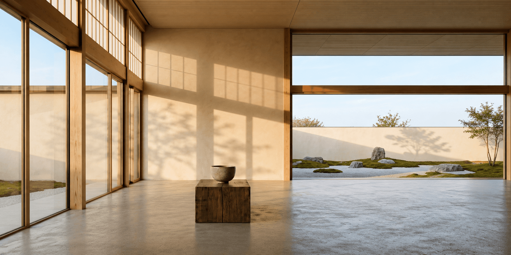
Teaure explores what happens when an ecommerce experience is designed around the feeling surrounding a product, not just the product itself. The goal wasn't to make users move slowly. It was to make the movement feel intentional.
Built for Atmosphere and Clarity.
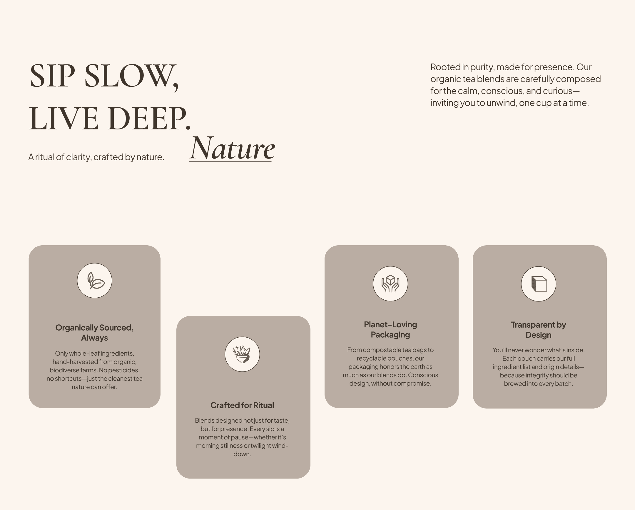
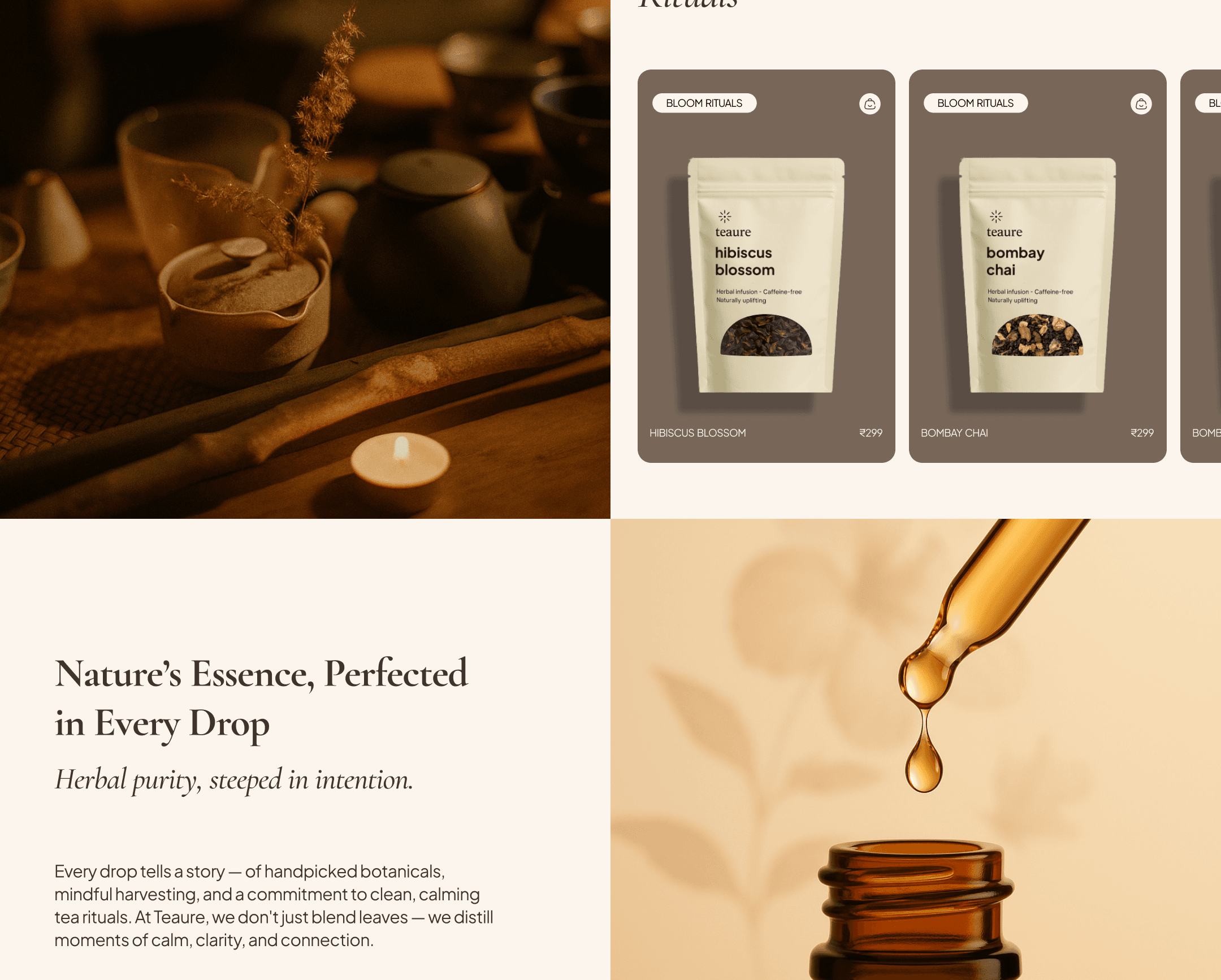
The visual language balances warmth with precision. The system is designed to support the experience, not dominate it.
Design Principles
Cormorant
Garamond
Cormorant Garamond creates the editorial, tactile voice of the brand.
Plus Jakarta
Sans
Plus Jakarta Sans handles navigation and product information where clarity matters more than expression.
08 / Hypotheses to Test
Because Teaure is a concept project, these are hypotheses rather than measured outcomes.
09 / What I Learned
Adding more visual richness doesn't automatically make an experience more immersive. Sometimes removing elements creates more room for the feeling to exist.
The strongest transitions weren't the most dramatic ones. They were the ones that helped users understand where they had moved.
The final interface feels minimal because a lot of competing ideas were removed before it reached this state.
For Teaure, the interaction model became part of the brand expression itself.
If developed further, the next step would be validating these assumptions through usability testing, behavioral analysis, and iterative refinement.
If I were taking this into Iteration 02, I'd focus on testing where atmosphere stops helping and starts getting in the way.